
- When Do You Need a Text-Based Logo?
- Choosing Proper Design Elements
- Creating a Text-Based Logo With ZenBusiness
- Text-Based Logo Collection for Inspiration
Think of Disney, Harry Potter, or Cadbury and you’ll imagine words written in unusual fonts. This is how text-based logos work. They express the character of a brand through typography, form, and color. This type of identity works for brand recognition and therefore is particularly effective when starting a business. Read the article to learn how to create a catchy text-based logo.
When Do You Need a Text-Based Logo?
Text-based logos include only the company name without images. This type of identity is considered to be timeless and independent of the business area. Let’s consider four reasons to create a text-based logo:
- To emphasize the company name. It is perfect if it consists of one or two short words (Sony, Nokia, Calvin Klein). If the title is longer, consider using a monogram (BBC, HBO, or IBM).
- To announce your company. The more people see your name, the sooner they’ll remember it. This is especially important for those who enter the market and want to become recognizable.
- To use a creative font. Unconventional typography is self-sufficient and needs no images.

- To stand out from the competition. Choosing an appropriate symbol for the logo can be difficult, especially in competitive niches (e.g. burger icons for snack bars or Themis for notary offices). A text-based identity helps differentiate your company from the competition due to a wide range of fonts and colors.
Choosing Proper Design Elements
The key to successful text-based logo design is close attention to detail. Let us explain why brands tend to choose sans serif fonts and how to accentuate your logo using colors.
Selection Criteria
An identity is a visual expression of a brand’s character demonstrated through colors, fonts, and graphics. Thus, the development of any corporate identity begins with a careful brand analysis and positioning.
- The nature of business. Put down a few dozen associations related to your company: e.g. informal, friendly, caring for the environment, etc. Answer who you are and look for visual solutions that match these associations.
- Target Audience. Analyze your customers: who they are, what they are interested in, what values they have. Choose the tools that will convey your message in your target audience’s language.
- The competitors’ identity. Consider some text-based logos most commonly used in your industry. Choose the typography and colors that will make you stand out from the competition.
Font
Having conducted a preliminary analysis, move on to the choice of design. Typography is what bears the key semantic load of a text-based logo. It influences the ease of the psychological perception of the brand. Follow these simple steps to make your choice.
1. Decide on the font type. There are four main types most commonly used for logos:
- Serifs are preferred by brands that need to emphasize their status, tradition, professionalism, or prestige (Tiffany, Rolex, Gucci).

- Sans Serif fonts are used by 73% of brands (Netflix, Microsoft, eBay, Facebook). They are easy to read on PC and cell phone screens even when zoomed in low resolution.

- Script fonts are often used in projects related to creativity, home improvement, and health. They help brands get closer to customers and create an impression of friendliness and openness (Kleenex, Barbie, Walgreens, Cadbury).

- Display fonts are chosen by companies that want to emphasize their uniqueness and stand out in the market (Disney, The New York Times, Harry Potter, Kool-Aid). You should be careful when choosing these fonts: remember that customers should read the name easily even in small print.

2. Choose typeface. Most of the standard fonts contain several outline variations such as normal, bold, straight, italic. Pick the one that best expresses the character of the brand. Think about the letter case: capitals, lowercase letters, or a combination of them.

3. Consider the kerning, i.e. changing the distance between the letters. Although the spacing is always the same, it may sometimes seem that the distance is too big or too small due to the peculiarities of the shape and letter combinations. In these cases, it is adjusted manually so that the inscription looks harmonious and causes no difficulty when reading.

4. Check the scaling. See how the inscription in the selected font looks in low resolution. The logo should remain legible even on small media such as business cards or spacers in email signatures.
Color
Color choice is another way to tell about the company and attract the consumers’ attention. These are the aspects that should be considered:
- Color as well as font affects the psychological perception of the brand. For example, red will create the impression of strength and energy, blue of calm and confidence, and black-and-white of luxury and style. Choose a color based on the impression you want to make.

- Try combining several colors. This is a great way to personalize the identity especially if you use popular colors. For example, Google and eBay highlight each letter with its own color, Flickr highlights the last one, and Visa only emphasizes the V’s tail.
- Think of several variations for different backgrounds: white, black, and colored.
Shape and Graphic Effects
Extraordinary graphics or an unusual shape will give a zest to a text-based logo. We offer several ways to revive your logo:
- Replace a letter with a symbol. Choose what is associated with your company. Pixar replaced the “I” with a lamp which became the main “character” of the animation studio’s cartoon, and Coverfox turned the “O” into a fox’s tail.
- Try various outlines. A stand-out element always attracts attention. It can be an enlarged letter like an “A” in Braun, doubling as an “X” in Exxon Mobil, or extra graphics as the arrows in Subway.
- Put it in the form. You can place all words in the form, like Nintendo, Samsung, and IKEA, or highlight a part of the letters like LinkedIn or Hyperloop TT.
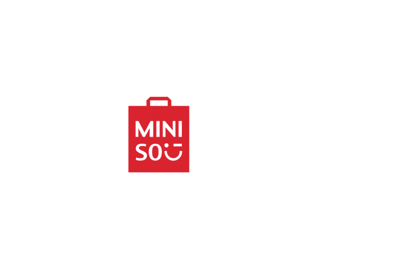
- Break it down into lines. This version will suit companies with a simple short name. The word should remain readable. This is exactly what Uniqlo did by dividing the name into two lines, which formed a square. And Miniso not only broke the word but also added a winking smiley at the end.
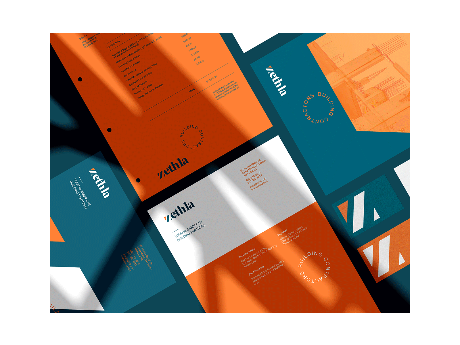
Creating a Text-Based Logo With ZenBusiness
We know that it’s not easy to design a creative text-based logo from scratch if you haven’t dealt with graphic design before. Online generators with ready-to-use business solutions will be helpful. You just need a few clicks to get a text-based logo with ZenBusiness ZenBusiness:
- Enter the company name and industry you specialize in and the service will offer dozens of options with the right fonts and graphics.
- Edit any selected image if desired. At this stage, you can change the font, color, and graphics. Although you cannot upload your font to the site, you will definitely find the right option in our collection. We have compiled dozens of professional fonts – from the minimalist Sans Serif to creative Display.
- Want to replace one letter with an icon that symbolizes the brand? It’s simple! While editing in the “Text” field, delete the letter, choose any icon from hundreds available, and put it in the desired place manually.
- Adjust the size and scale if necessary – and your text logo is ready! The service immediately visualizes the logo: you’ll see what it looks like on business cards, letterheads, and other corporate identity elements.
Text-Based Logo Collection for Inspiration
To develop a creative identity, having examples as a source for inspiration is important. See how famous brands work with text-based logos to borrow some interesting techniques and get inspired.


Logo Tips


