Metropolitan Life Insurance Company (MetLife) is one of the biggest insurance companies in the world. Over the years, the company symbol has evolved from a reserved monogram to a comic book mascot. In this article, we’re looking at the unique branding journey of the insurance giant.
- Company backstory and its first logo
- Logo evolution
- How would MetLife logo look like if it were made in ZenBusiness?
Company backstory and its first logo
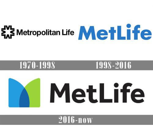
Although established in 1868, Metropolitan Life got its first logo nearly a century later, in 1964. On it, the designer Don Erwin put the company name together with a curious graphic. On first sight, the drawing resembles a star. However, if you look closer, you’ll see that it’s made from letters M and L. What a smart optical illusion!
Color blue traditionally stands for reliability and prosperity, which are the ideal connotations for an insurance company. The spectacular blue “star” makes you want to scrutinize the emblem in the search for other hidden meanings.
Logo evolution
In 1985, MetLife overhauled its brand identity completely. The company wanted to push the envelope and create a warm and friendly image, which was uncharacteristic for businesses in the insurance industry. A new emblem featured the merry Snoopy dog, an iconic comic book character. Plus, the design got a lighter shade of blue and an increased gap between the letters. That bold creative move turned out to be a tremendous success and received the brand for over 30 years.
In 2016, the insurance giant said “goodbye” to its charming mascot and switched to a cleaner design. A new logo had the brand name written in a black massive typeface. But what truly caught the eye was a striking letter M consisting of two overlapping graphic shapes. The existing black and blue color scheme was complemented with green which stood for vitality and energy.
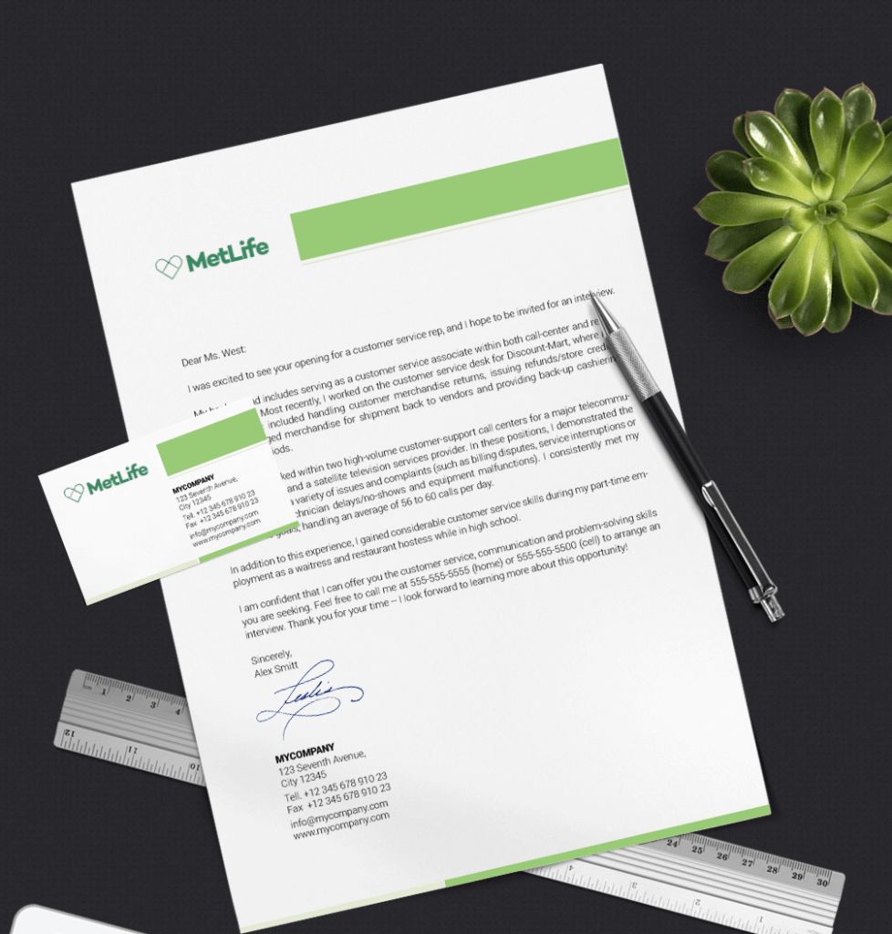
How would MetLife logo look like if it were made in ZenBusiness?
Bottom line
Let’s sum up the lessons we have learned from from the MetLife branding history:
- Opt for a powerful visual symbol with several meanings. Customers love multilayered emblems.
- Despite hidden meanings, your brand message must be easy-to-perceive.
- Don’t shy away from unconventional solutions. Who said that a serious company like MetLife can’t use a playful mascot as its visual symbol?
- Keep up with trends. Even with a timeless emblem, it’s still important to monitor trends and customer needs and adjust your logo accordingly.
Popular Brand Logos


