- How a black-and-white palette can enhance your branding
- How to use an achromatic palette
- Beautiful black-and white logos
Are you breaking your head over how to create a timeless branding that won’t look outdated in a few years? Are you looking to bring forward your product value or emphasize the unique personality of your brand? One way to go is to benefit from a black and white branding color scheme. In this article, we’ll examine how to make the most out of a black-and-white palette wisely and where to look for inspiration.
How a black-and-white palette can enhance your branding
Found at the opposite ends of the color spectrum, black and white are also referred to as “achromatic colors”. While black doesn’t reflect light at all, white is the most reflective color out there. Let’s see what advantages a black and white palette has to offer.
1. Simple to create. With a black and white palette, you don’t have to spend hours choosing matching colors that would look good together and reproduce well across different media.
2. Timeless. Think about iconic logos such as those used by Nike or Chanel. They’ve remained unchanged throughout the years. An achromatic color palette makes for a never-dying classic that can’t be overshadowed by overnight trends.
3. Versatile. Black and white look equally great on screen and in print. Still skeptical? There is an easy way to make sure that an achromatic design is a game changer when it comes to branding! Create a black-and-white logo with the ZenBusiness logo maker and test it across different surfaces!
4. Stylish. Achromatic designs stand out through their edgy and refined look. It’s for a reason that black is the second most popular color used by the Fortune 500 companies in their branding.
5. Dynamic. The striking union of black and white can add depth and volume to any design, which is paramount to drawing the viewer’s attention.
How to use an achromatic palette
Think about what emotions you’d like to evoke among your potential customers. What aspects of your brand personality are you trying to convey through your design? Let us remind you of the most important things to keep in mind when creating a black and white design.
Rely on color psychology
Take the time to scrutinize the meanings and connotations behind the two colors:
- Black is known for its wide spectrum of emotional connotations. It’s associated with fear, mystery, and mourning. At the same time, it’s the universally recognized color of luxury, elegance, and nobility. The nearly magical ability of black to make a product look more appealing makes it a common choice among premium brands.

- White conveys the feelings of kindness, safety, and peace. Using white in your branding is a great way to bring forward the integrity and transparency of your business and build trust with your target audience.

Use the functionality of black and white
Black is a good choice to:
- highlight specific elements of your logo;
- reduces the space of your design;
- set off bright colors.

Use white to:
- give a light and airy feel to your design;
- draw attention to the text, image or button (placing a text or a graphic against a light color is a surefire way to make it stand out).

Maintain a visual balance
Employing a black and white palette is a great way to put your sense of measure to the test. Professional designers warn novices against overdoing it with achromatic colors.
- If you go for too much black, you risk ending up with a depressing design which looks threatening and makes people feel uncomfortable.
- The excessive use of white may create an emotionally cold design that will transcend the feelings of detachment and isolation.
Beautiful black-and white logos
As always, we recommend learning from big-name companies that nailed their visual branding. We’ve brought together some fine examples of beautiful black-and-white branding across both digital and printed media.
Basic: Website
The website of the Basic branding agency is one great example of how to build a strong, consistent company image in the eyes of your customers and partners. A black and white color palette is good at highlighting simplicity and accessibility which are the two fundamental values of the business. like Along with the color palette, this message is translated through:
- name (the company name “Basic” says it all);
- typography and graphics (no serifs; simplistic illustrations that look like they were made with a pencil);
- layout (there is enough air and space between the elements).
Here are a few more tricks that enhance the visual branding and capture the viewer’s eye. For example, some of the elements on the web page that start moving once you hover the mouse cursor over them. Colored photos add the much needed contrast to the web pages.
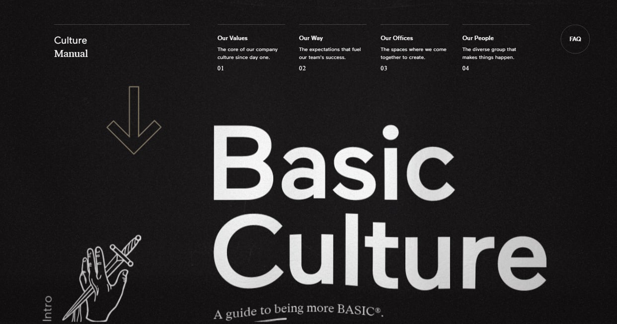
Tip. Make sure the visual appearance of your web pages fits their contents. To make your branding more dynamic, try spicing it up with unconventional shapes or images.
Black Estate: Labels
A winery based in New Zealand crafted stylish black-and-white labels that create a mesmerizing contrast with the shades of their wines. The names of vines on some labels are written in red and yellow. Using bright colors is a time-tested trick for capturing customers’ attention.
On top of that, the business makes a good use of the achromatic palette across other media, including product packaging and branded T-shirts.

Tip. Don’t be afraid to combine black and white with vibrant hues. This is a surefire way to add a dynamic feel to your design and accentuate the elements that you want to stand out.
Culinary Zen: Logo
On the minimalist logo of the Culinary Zen restaurant, you can see a fork, knife, and plate. The plate drawing is slightly unfinished and resembles the letter “C” which stands for the name of the place. With bright colors, the logo would look cluttered and chaotic. The achromatic palette, however, gives it a refined simplicity.

Tip. With a black and white palette, you don’t need to worry that the visual aspect of your logo may overpower its meaning.
SoundSwitch: Brand identity
SoundSwitch is a company that produces DJ software and hardware. The brand boasts a neat, straightforward logo. Along with the visually concise emblem, the designer also came up with black and white business cards, T-shirts, and packaging.
When you plug in the device, the white logo starts to shimmer in different colors, depending on what the DJ is doing.

Tip. Find an interesting way to breathe life into your black and white branding.
Requiem: Poster
This poster for a classical music concert was created by a renowned Swiss designer Armin Hoffman. The main idea behind the design is based on the striking resemblance between the human ear and the bass clef. The play of light and shadow draws attention to the curves of the depicted objects and adds volume to the design.

Tip. Strive for creating a smart brand identity which conveys multiple meanings through as few elements as possible.
Final word
When crafting a black and white art piece, the most important thing is to pinpoint the message you want to send to your target audience. Let’s recapitulate the things you need to keep in mind:
- Make sure your achromatic palette goes in line with your brand personality. While a black and white scheme is a good choice for a fintech business, it might look out of place when used by a travel company or entertainment agency.
- Decide whether you want to apply a black and white palette to your entire brand identity or just individual elements (e.g. logo, patterns, packaging, etc.).
- Think about how you can enhance your black-and-white design. It can be accent colors, unusual graphics or fancy typography.

